Eunoia
W Scroll Down
Overview
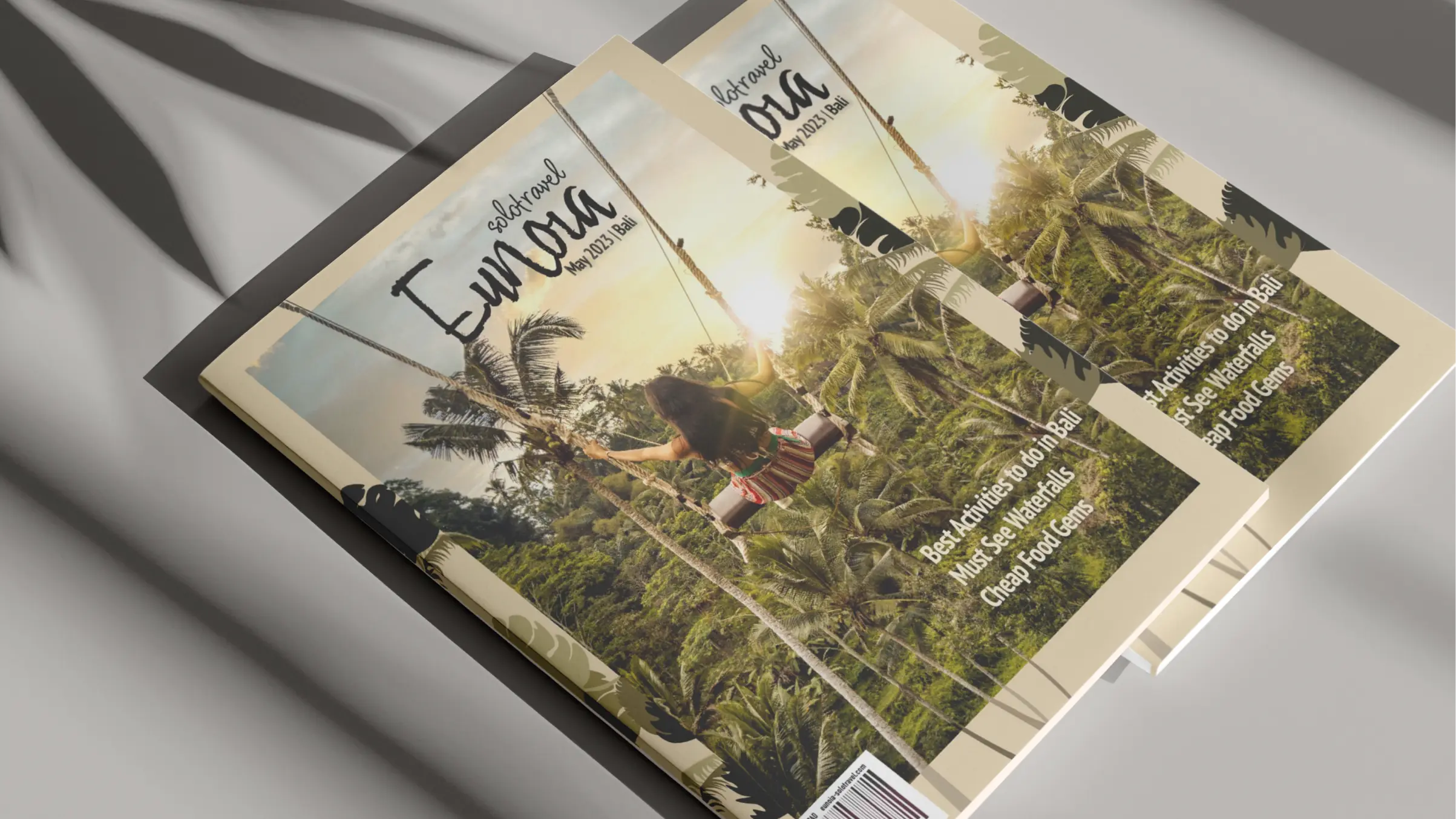
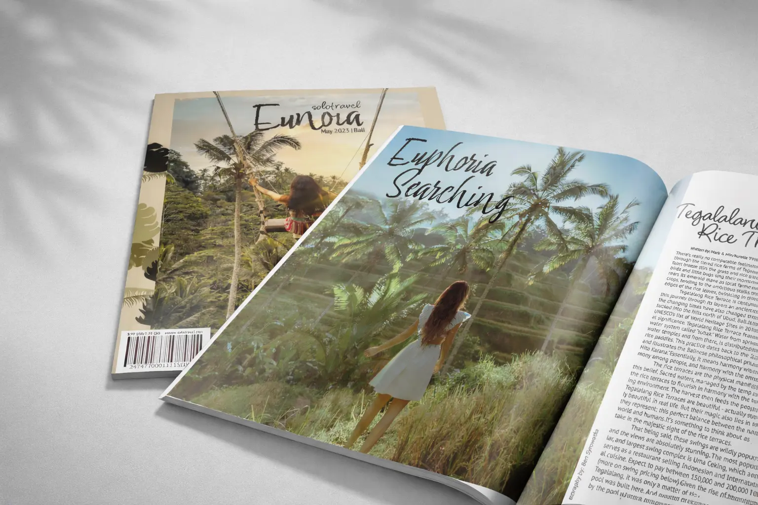
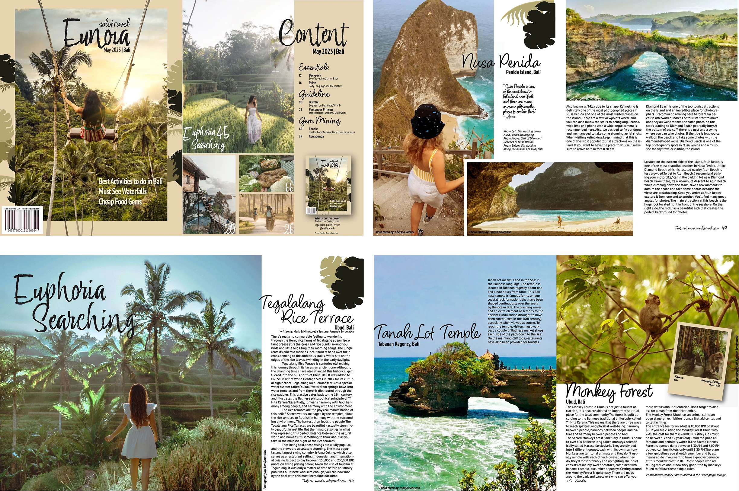
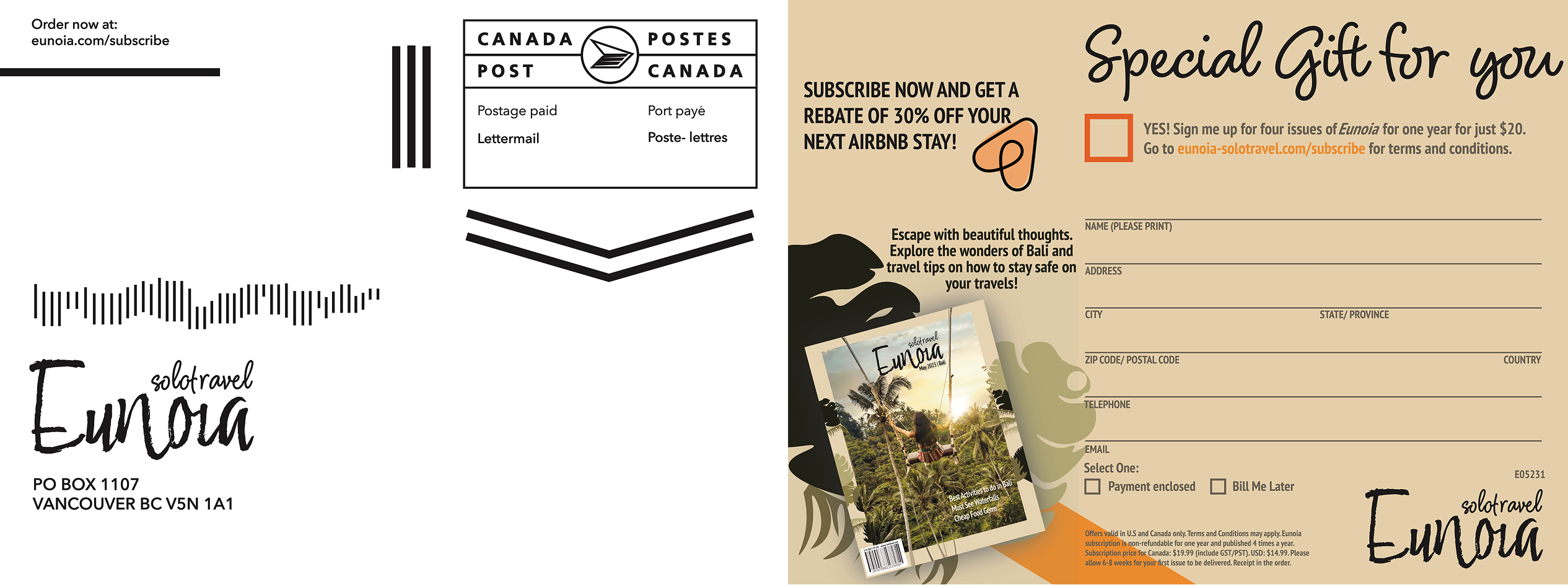
Eunoia is a magazine for solo travelers, inspiring their next adventure. This issue highlights solo travel in Bali, featuring destinations, activities, and hidden gems, all reflected through the magazine’s tone, typography, and visual identity.
2022
Editorial, Graphic Design
Adobe Indesign, Adobe Illustrator

brand
Eunoia’s visual identity embodies the essence of solo travel, where every journey becomes a path to emotional clarity, inner confidence, and meaningful discovery.

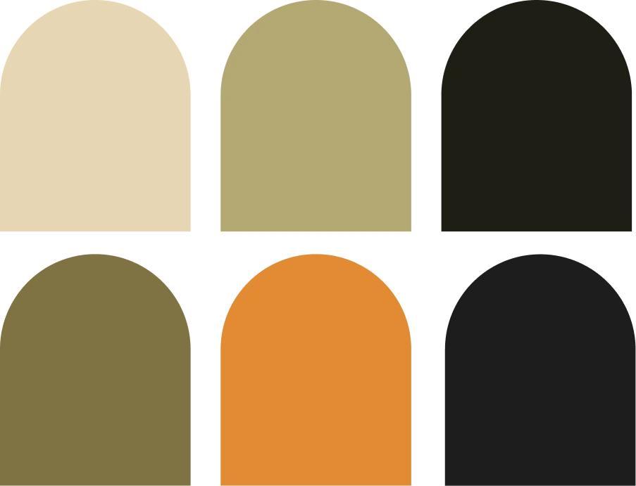
COLOR SCHEME
I added a beige border to balance the lush greenery and give the eye a resting point, while the hand drawn illustrations invite readers in. Tropical leaves with bright orange and dark green accents guide attention and add vibrancy to the design.

Typeface
This connection is reinforced through the typefaces, with Adore You, Bilthe, and Myanmar MN, whose handwritten and scripted styles reflect the brand’s playful, carefree spirit. The magazine’s tone is like an older sibling sharing travel tips, fostering a personal connection with readers.
OUTCOME
Through this experience, I learned the editorial process of planning a magazine layout, including setting the publication timeline and defining the brand identity and tone of voice through an editorial mandate. I also worked on engaging audiences and promoting the magazine, adapting the branding across various formats such as subscription spreads, website tower ads, and webpage promotions.