Meladust
W Scroll Down
Overview
Meladust was born from the goal of empowering our community to overcome insomnia by offering purposeful products designed to enhance sleep quality. Our branding focuses on customer awareness, competitor analysis, and the selection of key ingredients known for their relaxing properties.
2024
Packaging Design, Marketing
Adobe Illustrator, Figma
iterations
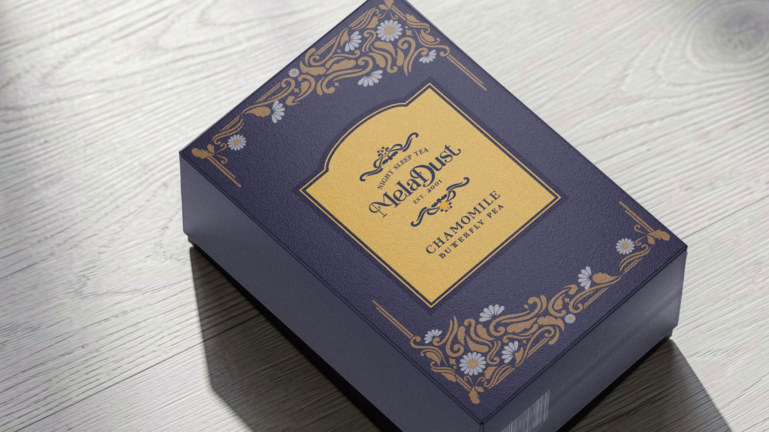
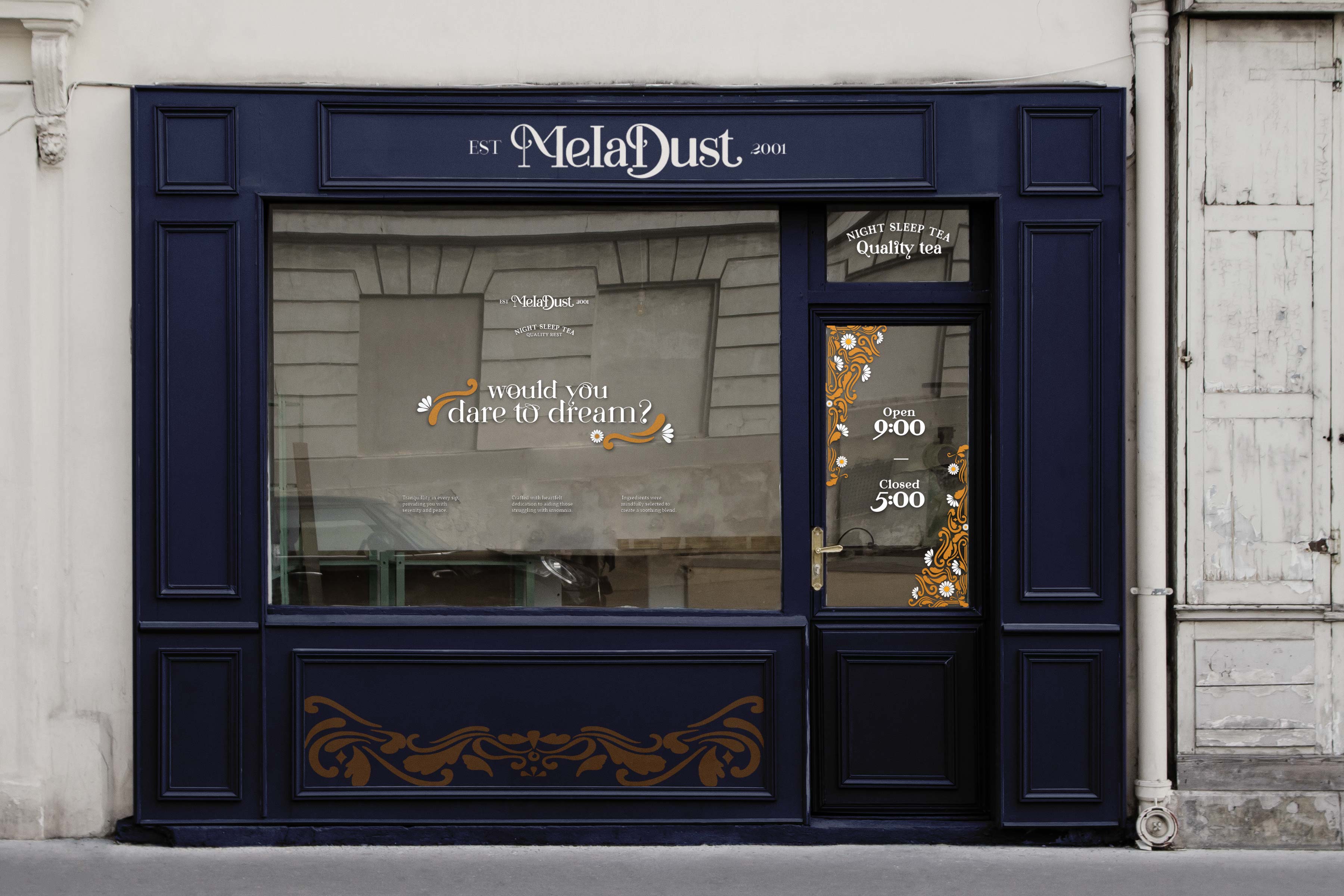
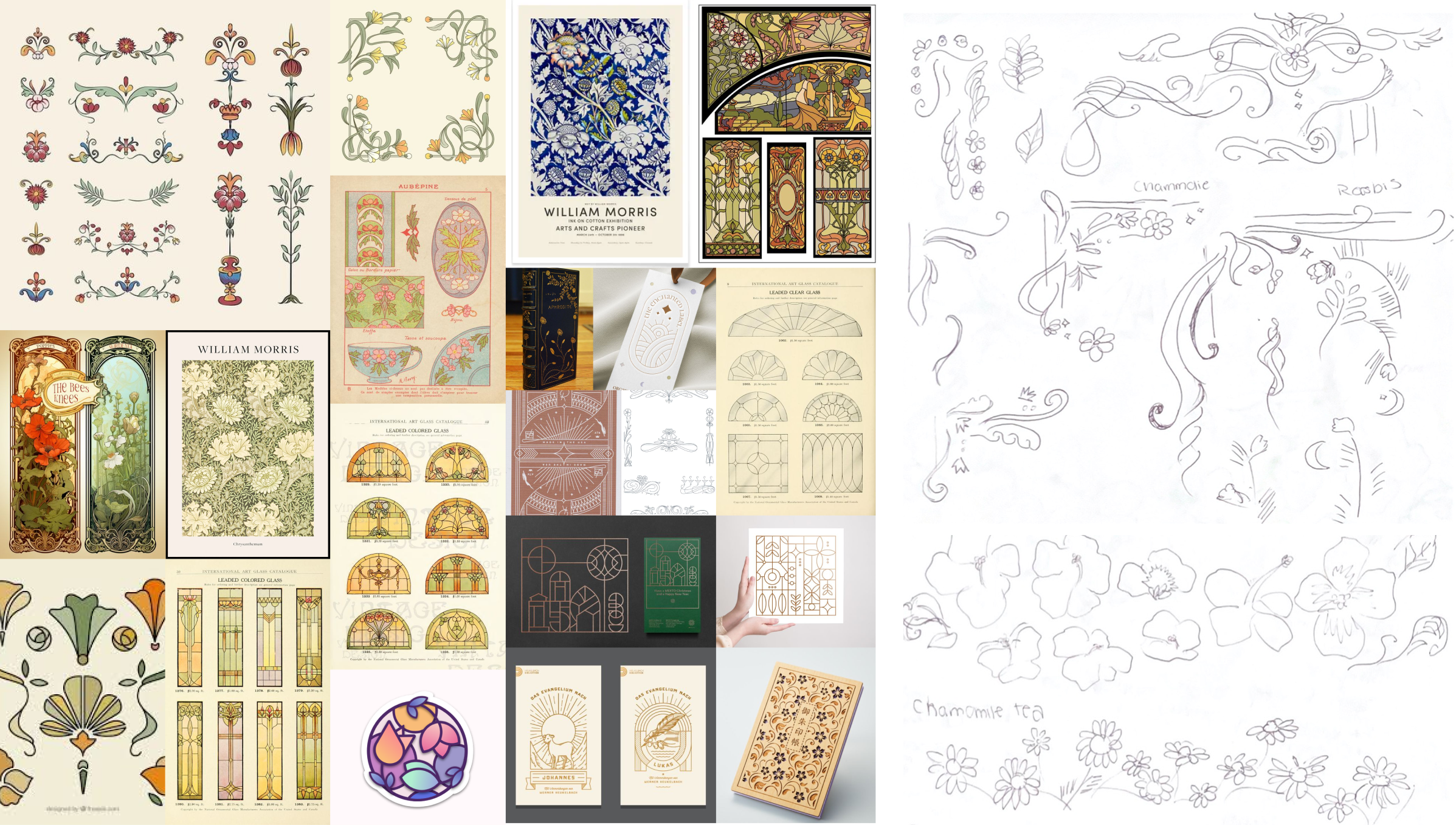
The art direction is inspired by the Art Nouveau era, evident in the floral motifs adorning the borders. To blend modern art practices with the Victorian era, I emphasized the fluidity of the lines to display a sense of continuity while also maintaining an intricate sense of pattern and repetition.
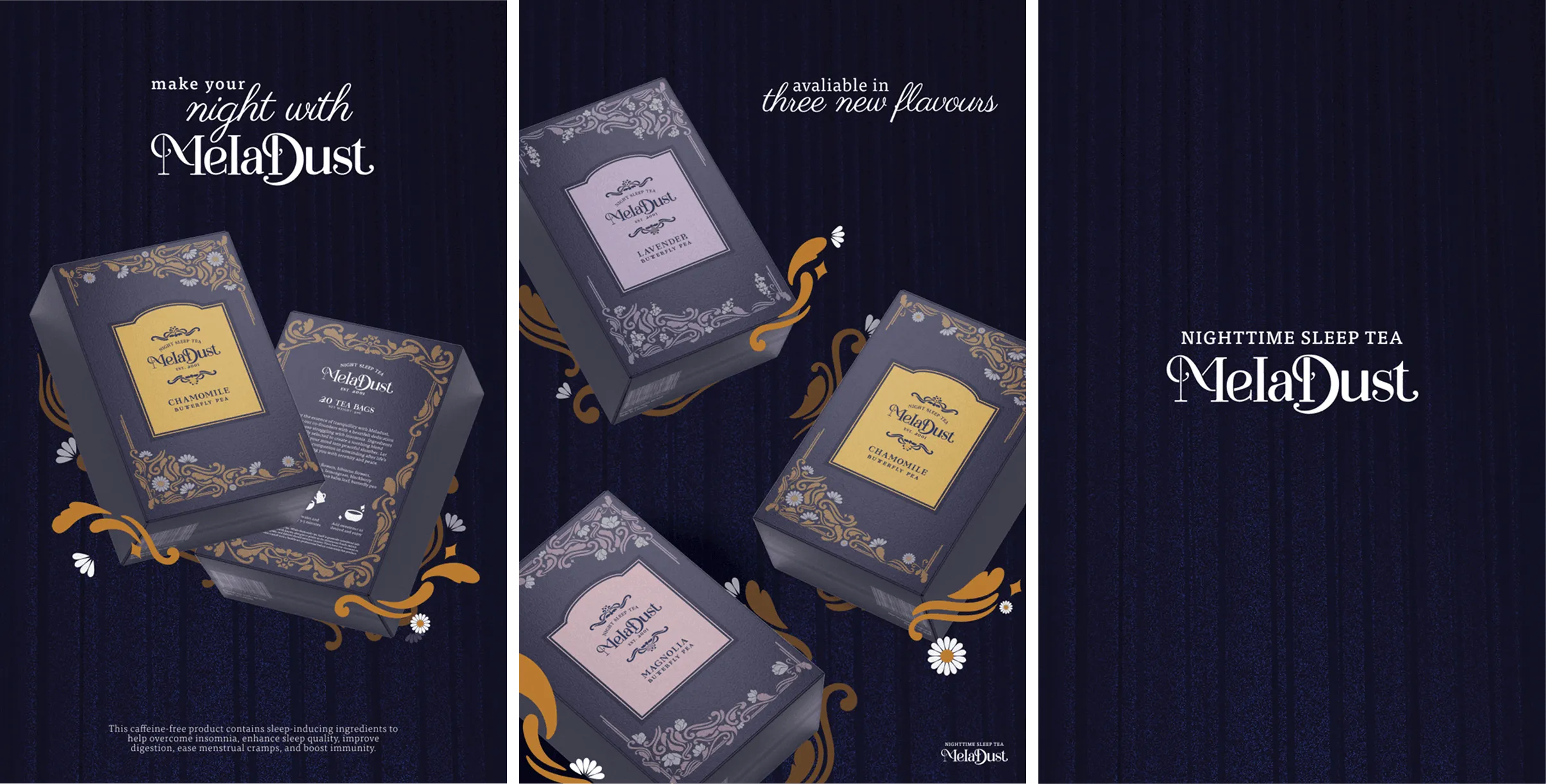
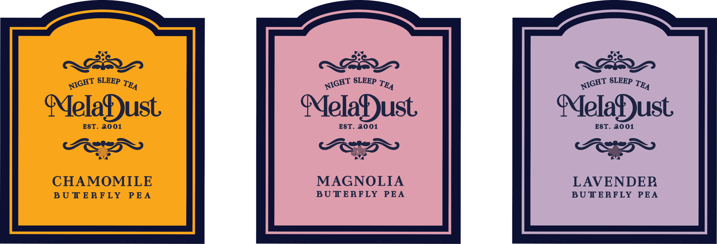

LOGO CREATION
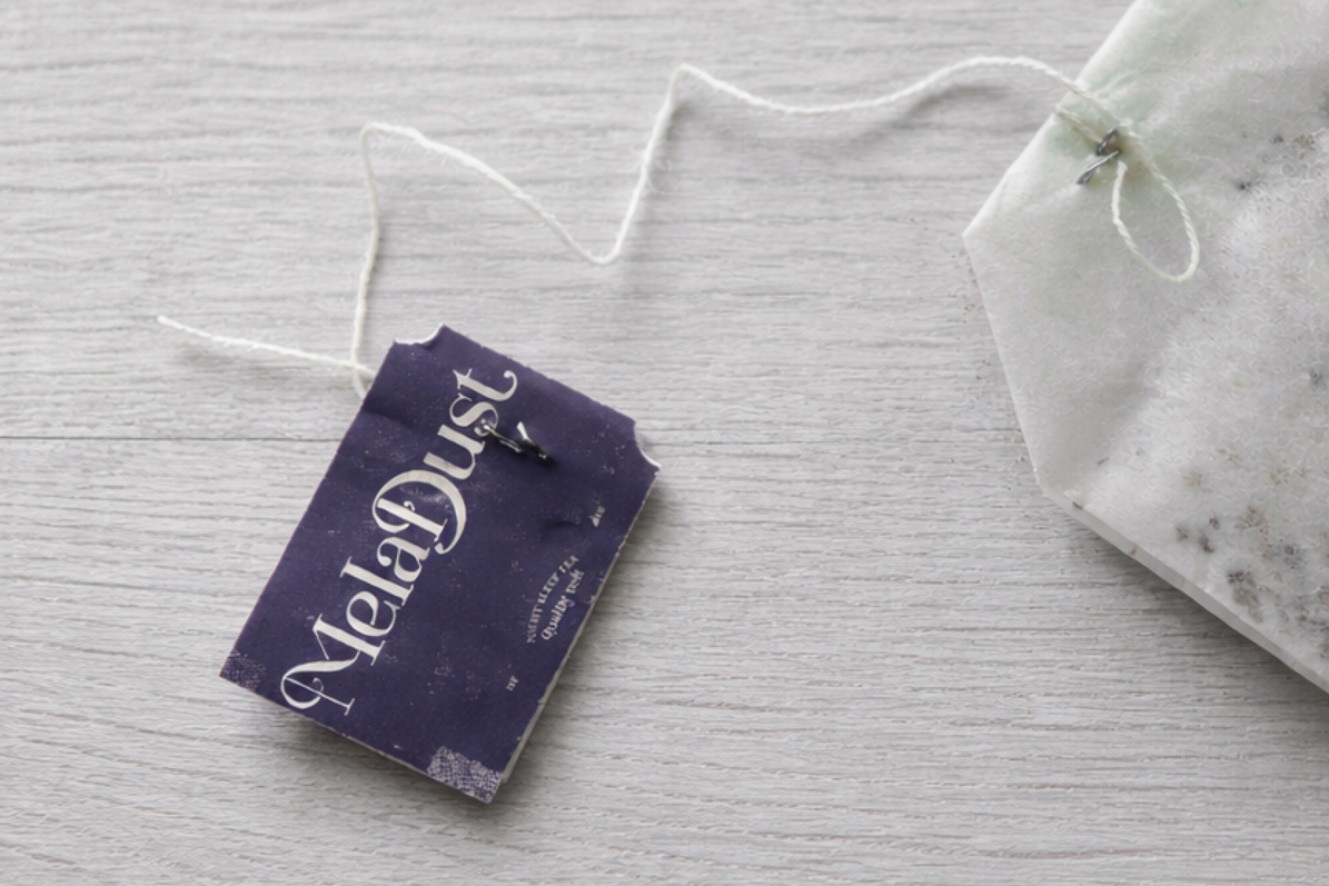
The logo was created with careful attention to seamless letter connections, creating a strong sense of continuity. I then carried these same design principles throughout the brand, guiding the development of our floral motifs and emphasizing the importance of consumer consideration and design consistency in building a cohesive brand identity.
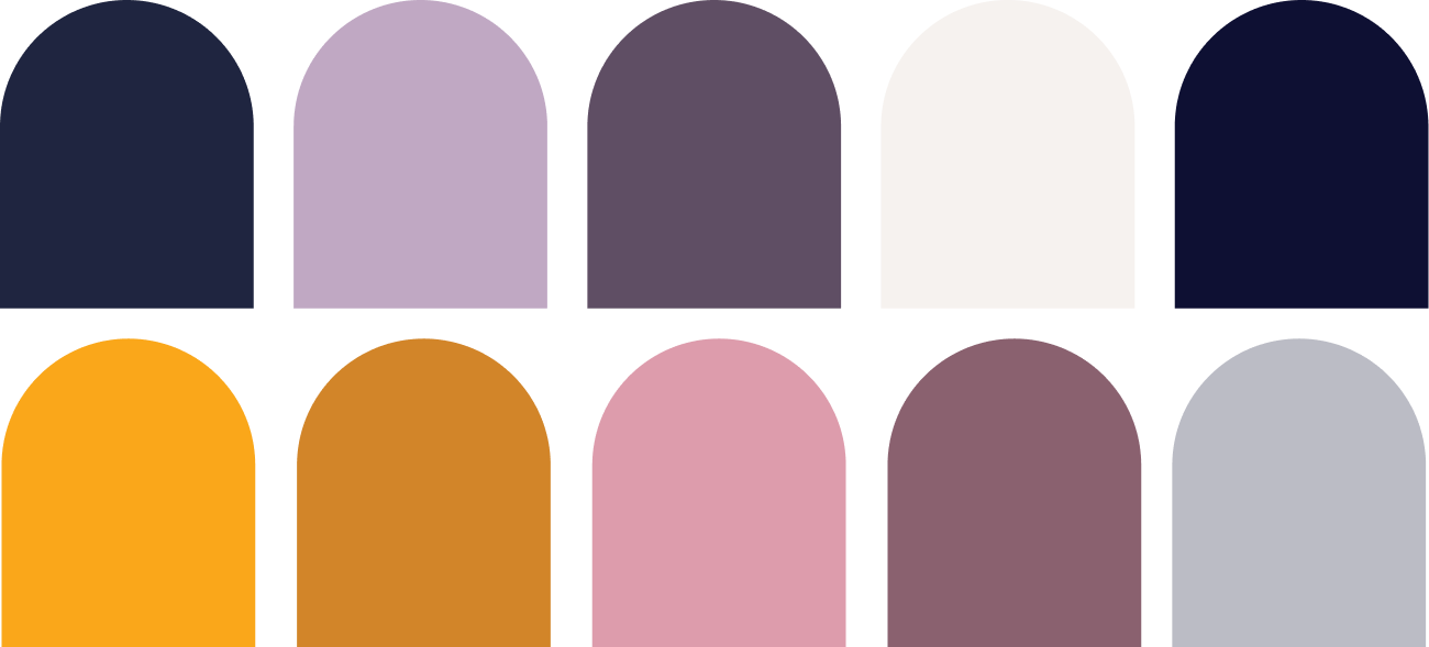
COLOR SCHEME/ TYPEFACE
The color scheme draws from nighttime sleep palettes, with a deep midnight background and soft accent tones. This calm elegance extends to the typefaces, Tisa Pro and Paris Pro, inspired by the Art Nouveau era to create a timeless and trustworthy brand identity.

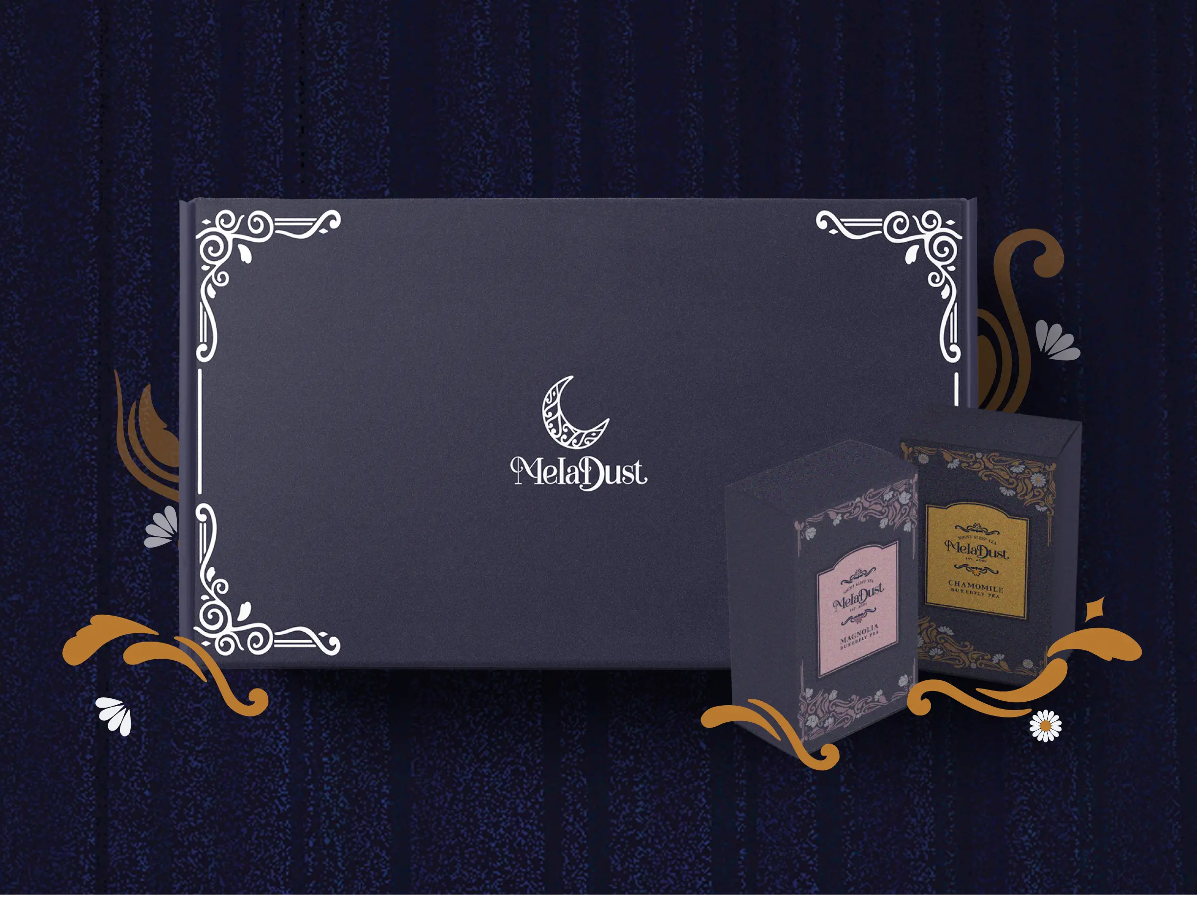
OUTCOME
This project allowed me to further explore branding and packaging design. Gaining insight into the historical context of printed artworks deepened my appreciation for reimagining and bridging past influences with modern practices. By incorporating this style with a contemporary twist, contrasting dark backgrounds with light, delicate elements, the product achieves a distinct look that balances vintage aesthetics with modern design.