Raingarden
W Scroll Down
Overview
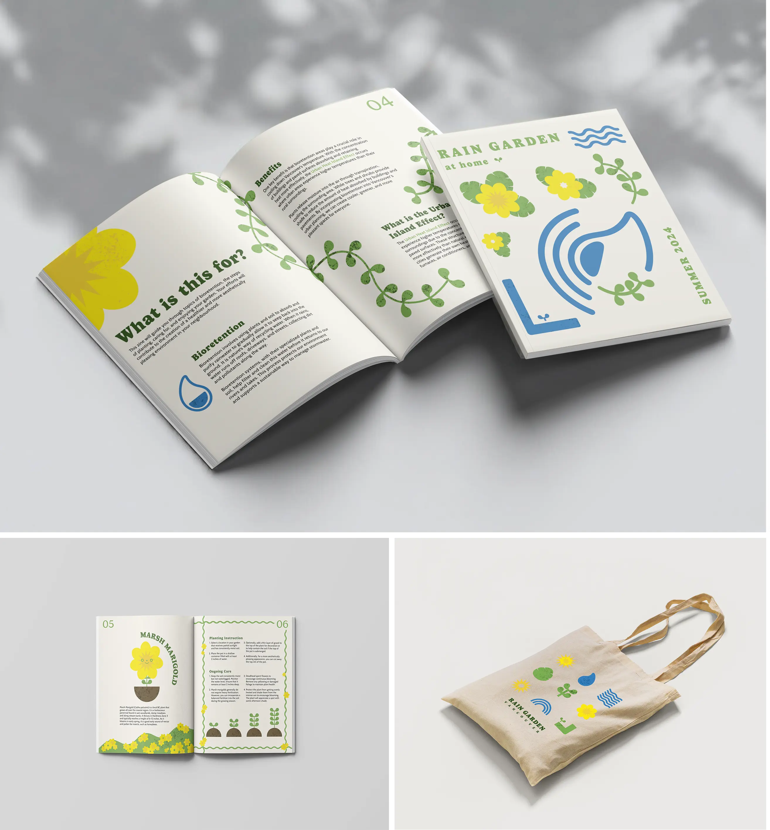
Raingarden at home is a team project we worked alongside with CityStudio by City of Vancouver. Our aim was to get people more involved with the horticulture involved in the development of bioretention gardens by providing people with the tools and knowledge they need to start their own garden. I was in charge of branding creation of our assets, color schemes, and art direction.
June 2024
Branding and Packaging Design
Adobe After Effects, Adobe Illustrator, Figma
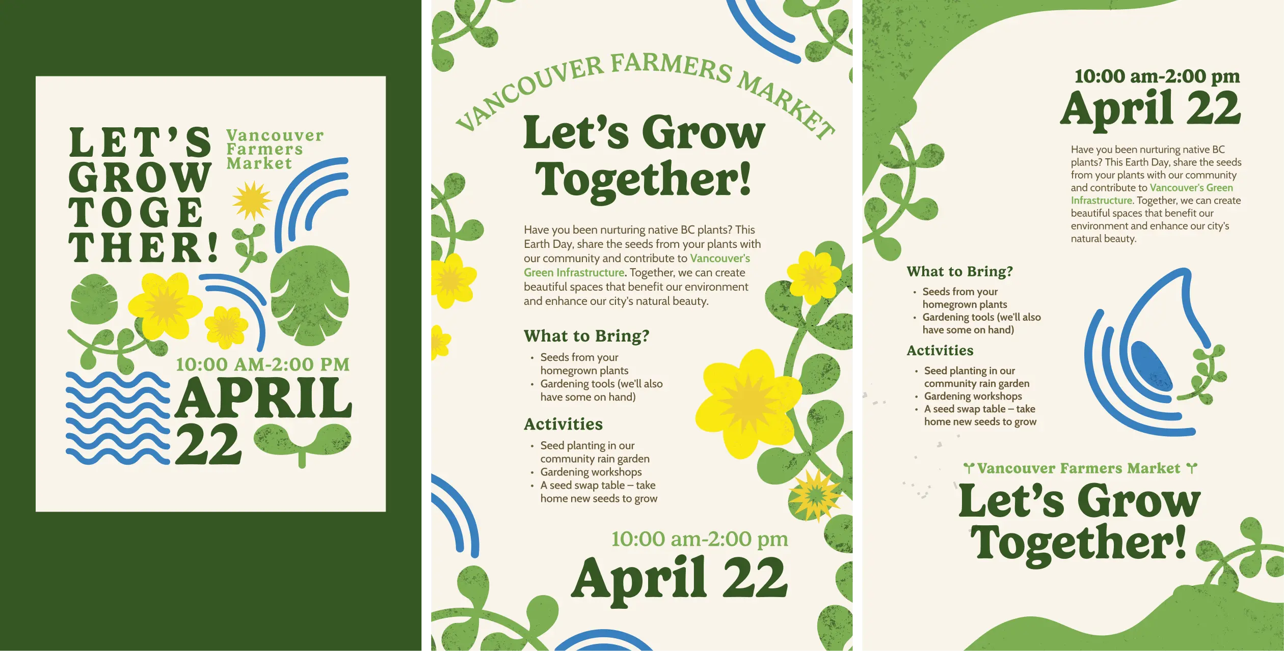
Brand design
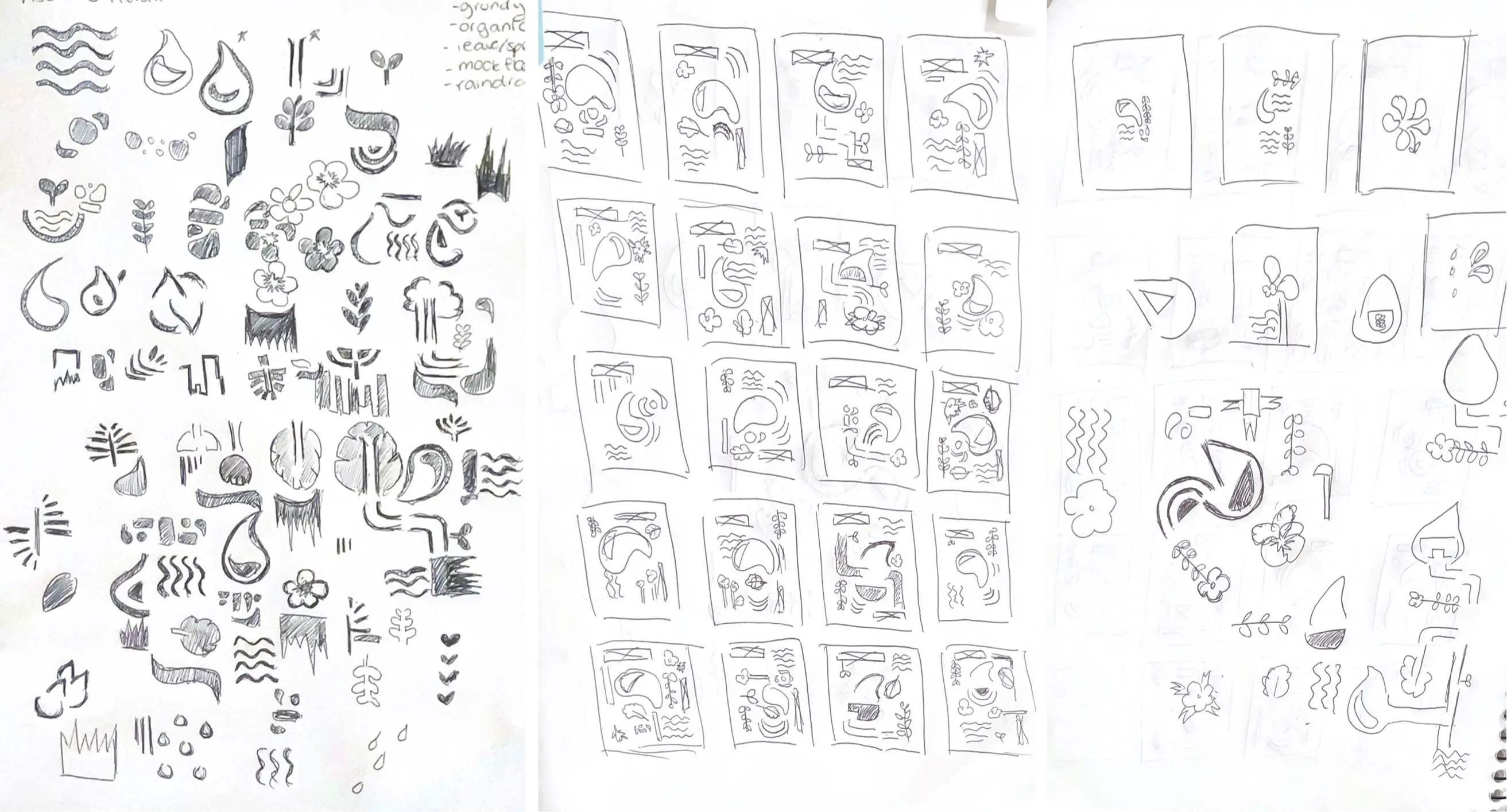
The branding design originated from our UX research where through detailed analysis on bioretention, our targeted scope, identifying the problem and how to connect with our audience. By identifing the why in our project, we were able to shape our branding in informing the public on our upcoming events.

Typeface
We choose Gelica and Cabin for our headings and body copy which are both welcoming and rounded typefaces. We wanted to evoke the sense that anyone can garden, regardless of experience or skill level.
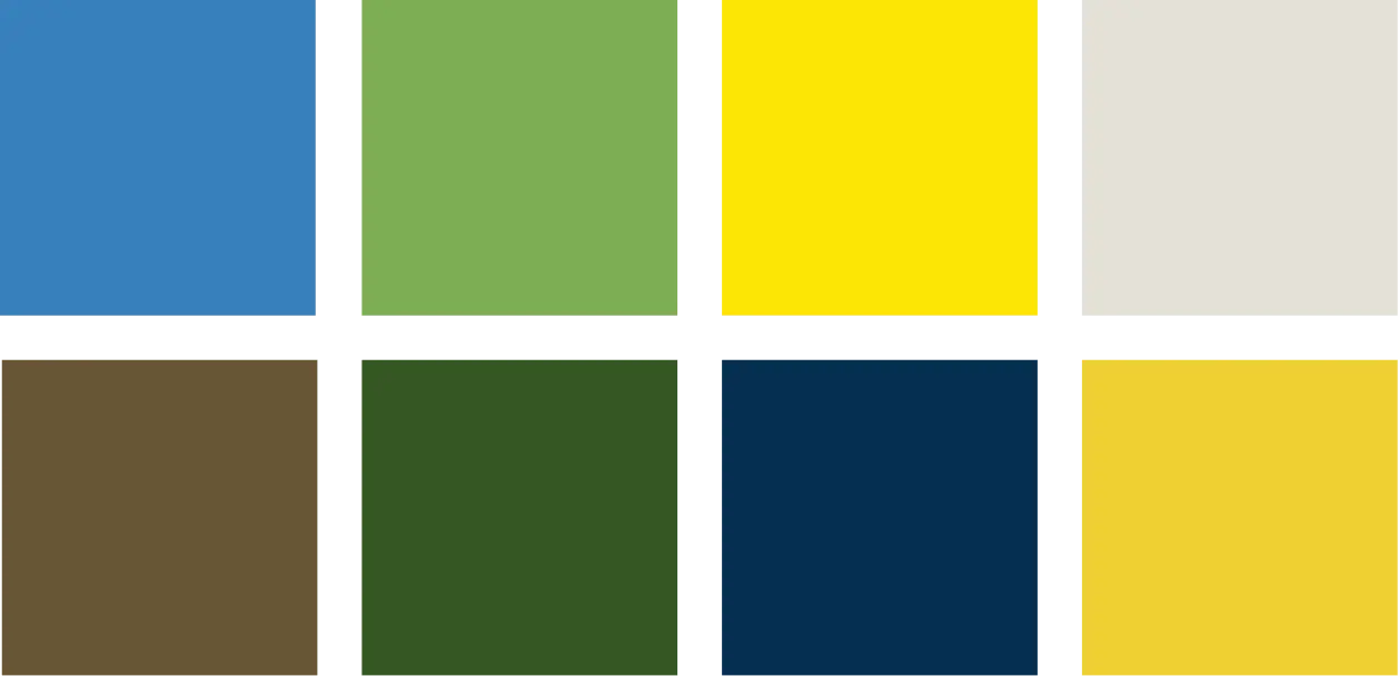
Color Scheme
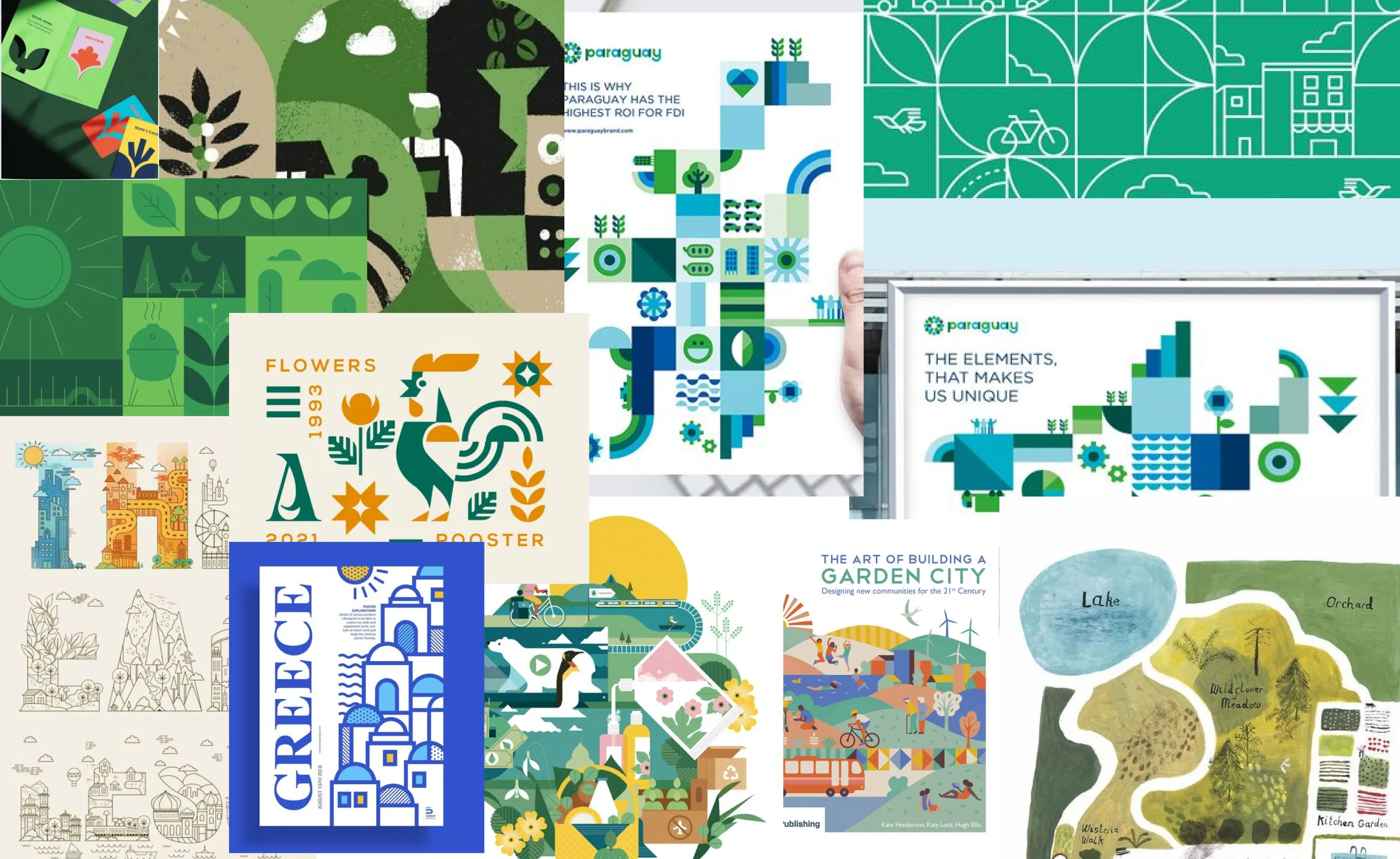
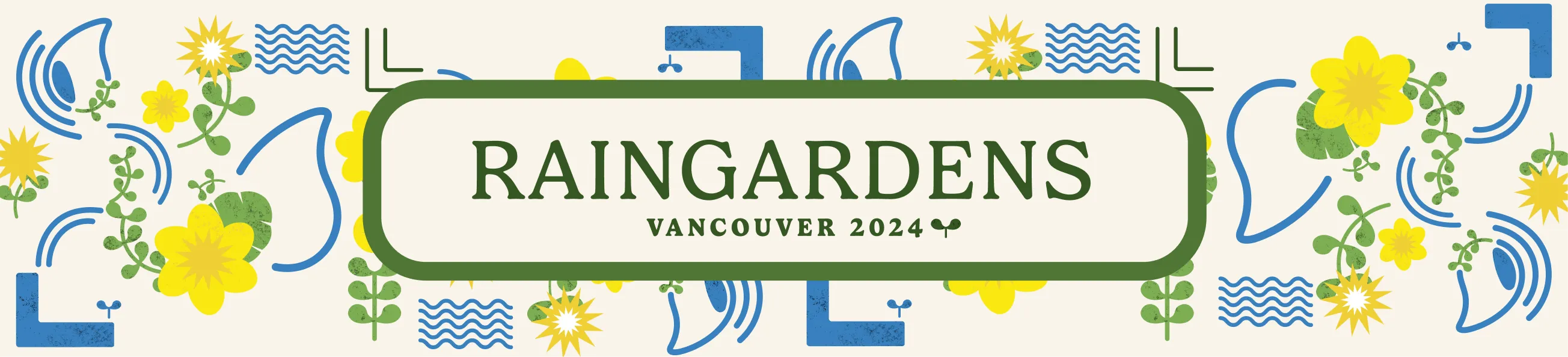
For our overall art direction, we went for a friendly, earthy, and organic feeling. We followed the colour scheme from the brand guidelines for any city signage. As these colours were also well saturated, it lends itself to our more open and friendly art direction. For the organic feeling, we used a textured noise image to overlay onto our illustrations to give it a more grungy and organic feeling to reference the sustainability initiatives in our project.
OUTCOME
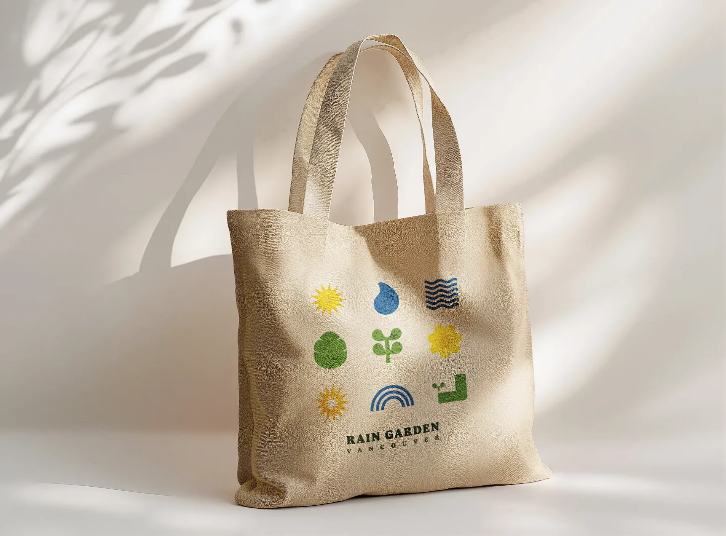
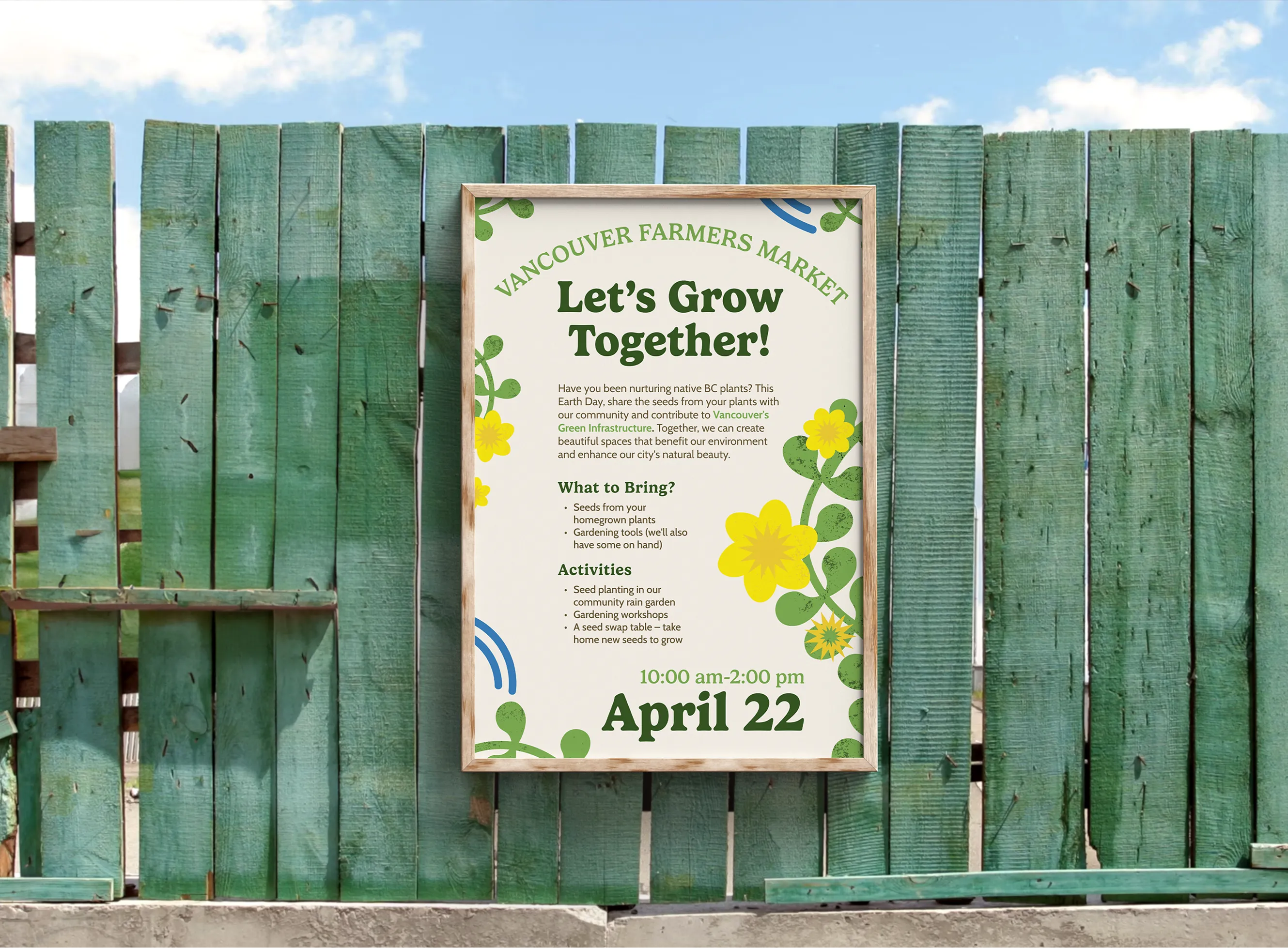
The project engages the community in sustainable gardening by providing practical tools and knowledge. Tote bags with seeds and tools, along with a zine on bioretention, help people start their own rain gardens, build a connection to the environment, and encourage them to take an active role in environmental stewardship.